First of all we like to thank everyone for their input on our new design, being it positive or negative. Once again the saying “you can’t please them all” turned out to be so true. We can’t deal with taste-related issues, but we will try to explain why some choices were made.
Color setting
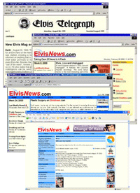
Well, we wanted to keep something familiar. That is why we chose blue to be the main decoration color. We’ve done so for almost our complete existence and since we either like it, or are used to it we kept it that way.
We saw a comment on the white background. Overall it is true that a high contrast (like black/ white) is not that easy on the eye, and indeed that’s why we had a soft yellow as background for years. On the other hand older people often prefer a high contrast, since it is clearer. We have to face that the average age of our visitor is growing and growing. So the choice to change now was obvious to us: a very dark grey on white it is.
The comments on the purple link color were very true, it was a little omission and we changed that to very dark blue, so it is less disturbing but it keeps its functionality.
The blue bar on the home page underlines the fanclub side of our site. It points out the benefit of being a member of ElvisNews.com. Since 98% of our visitors are from the western world the placement of the news at the left should be no problem, since we are all left-right orientated.
Font
We are very aware of the font-size. We did it on purpose, and like EspenK pointed out everyone can change that through their browser anyway. Since not everyone is aware of that we added the text size option at the top of the site. Since it uses cookies, it will “remember” your setting for our site.
Logout
We are aware that we removed the logout button on each page, and you have to go to either the homepage or the member page to actually logout from the site. We decided to do that, since the option was hardly used and the way it is now it is still only one click away.
Images
ElvisNews.com is a site that focuses on the news regarding our man. Therefore it is more text orientated than the average Elvis site. After drilling the amount of banners down the design has become cleaner. Because of the editing system we use now, we have the opportunity to add more images to long articles, probably that meets the desire for images in the future (but we didn’t edit the old content).
Also don't forget that there are currently around 400 wallpapers and over 200 larger pictures available through our site for those who want to look at Elvis on their screen.
Reactions
The answer to the request for a “real” bulletin board is simply no. We have the opportunity to install it, but won’t do so. Monitoring our own reaction system (and that it is, not a discussion board, although it sometimes looks like one) is already a lot of work and we know the average behavior on bulletin boards and we have no need for another kindergarten under our wings. For discussion boards you can visit our friends from ElvisMatters or For CD Collectors Only.
I've read your reasons for changing the design of the site. I have to say with all respect due that I think you are wrong. But this is YOUR site and I can't argue with you on this matter. BTW, even an old fart like me prefers the old yellow background that was less agressive for my old eyes.
I also think it's not a good idea to be unable to login directly in any page, wherever we are. Because I don't want to log everytime I visit the site, and many times, reading the news or the articles, I want to quikly log in to give my opinion. In this case, I have to clic on members, opening a new tab (I use Maxthon or FireFox depending on my mood), then reload the initial page to have the "Give your opinion" link. But... that's ok, this is just an old fart's opinion. :-)
Thanks for the info guys, I still don't like the new look and I'm not all together sure I accept what you've written up there, but fair play for not getting offended at the negative comments. It's rare that when people ask for honest opinions they actually mean it, so top marks for character. I really don't like the blank white background, I wonder if it would be easier to look at if some kind of border was placed around each column and section; but that's easy to say when I'm not the one doing it I suppose. You do get my vote on the "bulletin board" issue: The straight forward and easy-to-read way in which we fans are able to voice our opinions is one of the key reasons this site shines like a beacon on the internet, don't ever change that!
I like the new design. The blue is easy on the eye and I think the font is fine with the white background. Although, I do miss the info on the side bars. I liked to be able to check it out and click on what was interesting to me. All in All anything written about Elvis is all I care about as long as no one trashes him then I'm happy.
Tell it like it is. Nobodys leaving for all the complaining. I've already gotten used to it and so will everybody else. Good job.
This new design is great : ouaw !!!!!!
Nice of you to respond to the readers remarks. I still feel that the home page is just less appealing than the earlier one. The 2 shades of blue made it less dominant. I agree 100% on the style of the news pages: the news without unrelated items AND no annoying google stuff (which was short lived anyway). Luckily the Giveyouropinion link is there now.
Yes, it looks good and I get used more and more... The 'purple issue' was changed, but I still feel not very comfortable with the white background, the soft yellow was much better. So, I hope I'm growing old enough to cope with the actual contrast ;-)))
It looks fresh and new. Well done!
Thanks for addressing our comments and concerns. I'm starting to get used to this new look, although I still miss the bolder print of the old website. Merry Christmas and Happy New Year to everyone at ElvisNews.com and all members!
I think the new design is great, it's easier to find what you're looking for. And you're doing a fantastic job with the site, thanks a lot!
It works. I'm happy with it! Thanks.
I don't like it.Simply because it looks like the sites that lost its domain and are unavailable.This site has lost its glory.Sad...
I think ELVISNITES says it all, i totally agree with her.
That's why I love it so much :-)