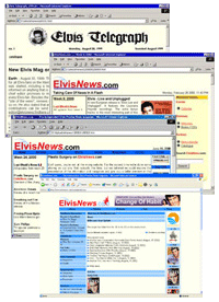
Not so long ago we gave a sneak preview and today it really happened. It took some preparation and a lot of work and due to personal circumstances it got a little set back, but now you are reading the “new” ElvisNews.com.
Change Of Habit?
No, there’ll be definitely no change of habit. We will keep you informed with the latest news like we did since late last century. The main change is the “fresher” look. Over the years the amount of buttons, banners and such grew and grew, until it got a bit out of hand. So we decided to clean up our own back yard and got rid of many of them. The most important links are still available on our homepage.
Also the endless repeating of the quickpoll, the quiz, the “login box” and other things in the left and right panels are gone from now on. Of course we show them on the homepage, but on the content pages there is more space for what really counts… the content.
What’s New?
Besides the cosmetic changes and the “removals” we added “Hot Articles” to the homepage. So from now on you also have an overview of what articles were hot the last period of time, next to the “Hot News” (was “Most Popular”).
We adopted a new editing system, which will appear to be mainly cosmetic to the visitor too, but from now on the style of the articles will be more flexible. We hope it will give a more attractive look.
Hopefully your experience will be as pleasant as the making of was!
Let us know what you think of the new design and if you find any error we overlooked, please let us know.
Ok ok... new look. I'm not sure about the colors you've used, bu heck... I'll try to deal with... ;-)
Paul, I don't think the colours of the French flag are chosen by accident :-)
Looks fine to me. I like this site period and have been coming here for years and hope to for many more.
WOW! when i turned on my computer this page jumped right out at me. looks great. it's obvious a lot of hard work and a lot of hard thinking went into this, i hope you don't tire of all this. thank you.
We'll have to get used to this change. I agree with PaulFromFrance... I'm not sure about the colors.
Well, only the 'purple' disturbs me a bit.... ;-)
I don't like it, it's impersonal, clinical, sterile, business like, and doesn't fit the screen. There is nothing that really says "Elvis" to me about it. It leaves much to be desired. Not intending to offend others, but the other website had more personality.
Why are certain bloggers names highlighted in purple under reactions?
The colors are a bit boring..nothing flashy..but it`s o.k. for me..it`s an Elvis site..and a good one..so keep on doing like this..
Ugly, plain ugly. First I though I misstyped the url and that I've been re-directed to an ad-site. Only on a second look I found the news somewhere in a bulk of chaos. A bad step backward. Sorry folks. Very good said Tcoil.
Excellent! The earlier design had a very "amateurish" feel to it - charming as it was, this new design says "no more monkey business - were gonna kick'em other sites ass!". I especially like the blue field in the middle with the poll etc. I've never seen a "sidebar" placed like that, totally crazy but I like it - creative and pure genious! *applause* Nevermind the guys wgho liked it "better before" - there will always be those who are against changes no matter what, both when it comes to music and on the web.
To be fair, I think we need to give a chance to the new look. I'm not very fond of it, but as for everything new, we need to be accustomed to it, I guess. Some things are not as easy as before. I miss the "LogOut" button, for example. To log out, I need to clic on the "Members" link, but maybe I've missed something. To Lex... don't forget to thanks the ElvisNew team for the French flag colors stuff. ;-)))) BTW, don't you think a phpBB forum would be better to fight between posters, or is it too much work for the team ? Anyway, I'll continue to come here. Sorry folks ! :-)
I'm starting to like the new look, but the change to 'purple' could be altered ...
I don't like it,it's very ugly. Bring back the 'old look' which was nice and original.
The fonts are smaller. Have to wear my glasses now. Red white & blue are also the colors of the US flag. You know where Elvis comes from.
I think the new look is NOT an improvement. In fact, i believe its pretty bad, and it looks like an 8 year old-child makes his first web design..... Bring bad the old design it was far far better!
Can't really say it's an improvement...but maybe that's because I am a guy who doesn't like changes...lol...
Steve, at the very top of the page over search, there is a text size button.
Ton... you're an old fart, that's all ! :-))) Maybe in a week or two, when everyone will be accustomed to the new look, a poll would be a good idea to know what the majority's feelings are.
Really sorry guys, but this new look is awful. As with all things, it may be just a case of getting used to it, but I have to agree with "Tcoil" on this one. When it first appeared, I thought there was something wrong with my computer. The old layout and format was what kept me visiting this site over the years, and now it just looks like all the other toss out there. I will certainly give it my best shot to get used to it, as ElvisNews is easily the best Elvis site out there, but I'm not so sure this new format will give me the feel I enjoyed so much with the previous look.
Oh, and one more thing: Not one picture of Elvis here either, come on guys who approved these changes, EPE?
I know I have to give this a chance, and try to get used to this "new look", but I REALLY DON'T LIKE IT. (Sorry to say.) The old format had much more of ELVIS on it, and was livelier- more colorful. Everything seemed to be much bolder on the old site. (JMO). As always, this remains my favorite Elvis website.
Yes, Paul I am an old fart I guess..I partically don't like the French colors ! :-))) But I will visit this site often anyway, because it's one of the best !
I was very fond of the previous format cause it was pretty efficient. We'll give it a try with that one, which won't be easy...but since the subject of Elvis happens to still fascinate me, I shall get used to it !
Seems like disgusting US colours to me, and this is really a horrible web design - they should get the one (or ones) that recently did Elvis.com - or even the one (or ones) that did the previous design on Elvis.com, which was awesome
Guys: You can increase fontsize on all HTML-based websites, just hit CTRL + to increase, CTRL - to decrease size.
1950's US colors. Maybe thats the point.?? The blue is not the right color for the flag if thats what your thinking Palle.
ElvisNews is THE site for ELVIS news there is and I really really appreciate all the time and efforts they invest in bringing us the latest news day in day out and year in year out. That all said I am sorry to say that I think the choice of change was not to my liking. The centrepiece of the homepage should be the news and it seems now that it is more about all these items in the blue. An improvement is indeed - as they mentioned themselves - that the news items are freed from all the excess. Well, as said I have to get used to the format. Visiting the site many times a day I will grow accustomed to it.
No no no, no change please ! Give us back the old look, change is not always better...I'm sorry !
Booooooo. Don't like the new design at all, especially the white backgoround. It's hard on the eyes (remember why you guys changed it in the first place back in the Elvis Telegrahp days? It still hurts the eyes!). I prefer the old design over this by far. Oh well, as long as I can get my news updates I guess it doesn't matter, but if asked, I would go back to the prior design. It worked so well, and looked great. This white has got to go.
It is tough on the eyes,but either way is fine with me,.as for the us comments thats one thing for sure we can do without,the poster of those comments seems to be full of vinom and nonsence,and lacking much else!
This new design is so terrible that i won't visit this site too often in the future.
I have been reading this site for a good number of years as an Elvis Fan. I have never become involved because I am not too keen on some of your member comments. I LOVE the site because it keeps me right up to date with what s going on... and for that Thank You!. The only problem with the New Look id the black writing on a white background. I find myself sqinting too read the content. Hope this was helpful and keep up the good work.
My Goood... It looks lile a political file page created by microsoft word... I DIDN'T LIKE IT...especially the color...
Thanks for all of your efforts and hard work in maintaining this site and for keeping us informed of what is happening in the world of Elvis. Every day I check this site, along with a couple of Australian ones (elvisinfonet.com and elvis.com.au), so that I can keep up to date with what is happening - keep up the great work.
At least Ernst Jorgensen will feel some comfort from all this feedback.. Elvis fans apparently don't like anything new. Great site. Great new look. Congrats.
Thre over-all look is better, only compant i have is the WHITE background, makes for HARD reading.
Smaller fonts. Harder to read. Otherwise okay.